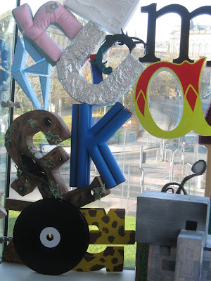
The thing I liked least about my uni course was how little typography and type-design the illustration students got to do, so when we got this project i was dead chuffed.
We all got given an individual letter to design and then make in 3D to contribute to a great wall that was to be constructed out of all the pieces.
Originally, taking inspiration from Russian letter-forms, modernist typography and grotesk type-faces,I was planning on doing a great monolithic letter out of metal, proper Richard Serra-like. But the uni doesn't have any metal cutting facilities and having it done outside of the uni would cost far too much. So I began panicing and thinking about what I could do instead. Eventually, I ended up basing my design around the theme of the negative space surrounding a letter. I got this idea from something a gentleman called Mike Parker said in the 2007 documentary-film "Helvetica" from Gary Huswit.
When the wall was constructed though, my letter got put in backwards. So it featured as a "b" rather than a "d". See below.


No comments:
Post a Comment